Rethinking hospital navigation
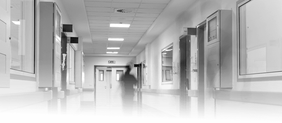
Hospitals are difficult to navigate. With miles of near-identical corridors leading to door after door of similarly-named wards and treatment rooms. Strict hygiene requirements mean decor must be kept to a minimum, and evolving needs means rooms often change purpose at short notice.
In this project I discovered the need for an entirely new method of navigation in hospitals. I proposed a radical new solution.
Data from 2013 suggests that around 6.9m outpatient hospital appointments, each costing an average of £108, are missed each year in the UK. Doctors attribute a significant fraction of these to navigation problems.
Digging deeper
Armed with only a hospital map and an NHS appointment letter, Nichola Musgrove (Senior UX Designer at Ordnance Survey) and I arrived at Southampton General - a large hospital undergoing redevelopment work - to experience the problems of navigating a hospital first hand.
It wasn't hard to see where the problems lay. Outdated signage, diversions for construction work and a hospital map that showed north as down and south as up.
To gain more insight into these problems, we released two surveys, one for patients & visitors and another for health care professionals (HCP's). It was surprising to us – and rather worrying to hear – that HCP's struggle with navigating hospitals as much, if not more, than visitors.
Switching focus
Agency staff, working across many hospitals and wards, find it difficult to adapt to their ever changing environment. On call doctors, navigating wards for crash calls - a situation where someone is fighting for their life - can waste vital time struggling to locate the correct ward. Staff told us that they often had to ask receptionists or volunteers for directions.
So our aim became to reduce the time it takes a health care professional to reach a patient during an emergency call.
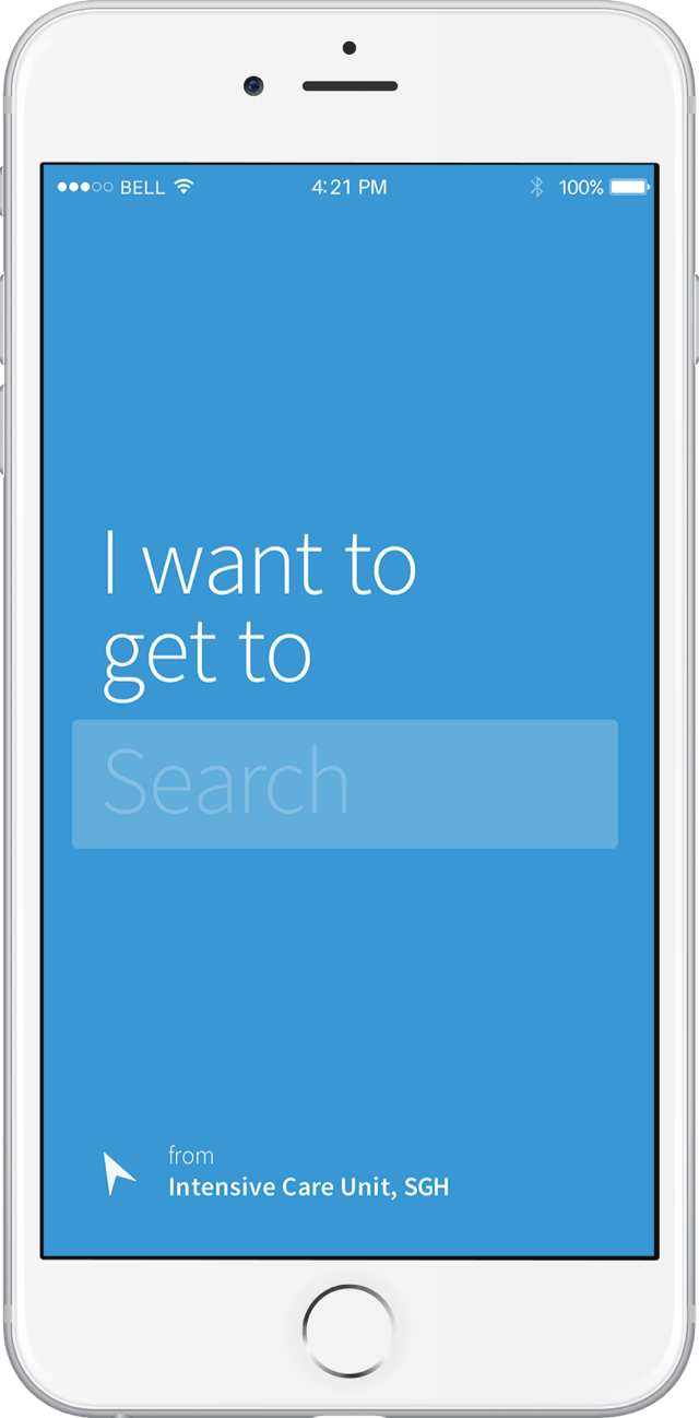
The solution
We proposed an indoor “sat-nav” solution, powered by bluetooth beacons and a mobile app, to help staff navigate the hospital quickly and efficiently.
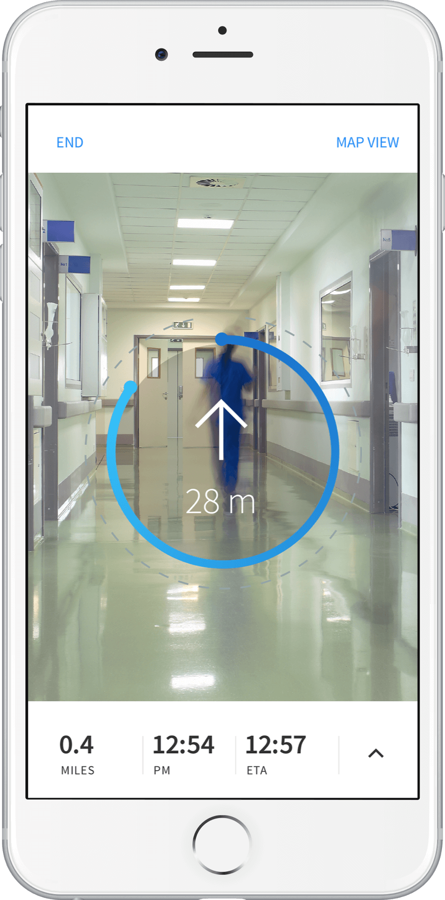
Augmented reality
In a crash call scenario, speed is paramount. An AR view gives the user turn by turn directions in a bitesized, easily digestible format, preventing errors in a life or death situation.
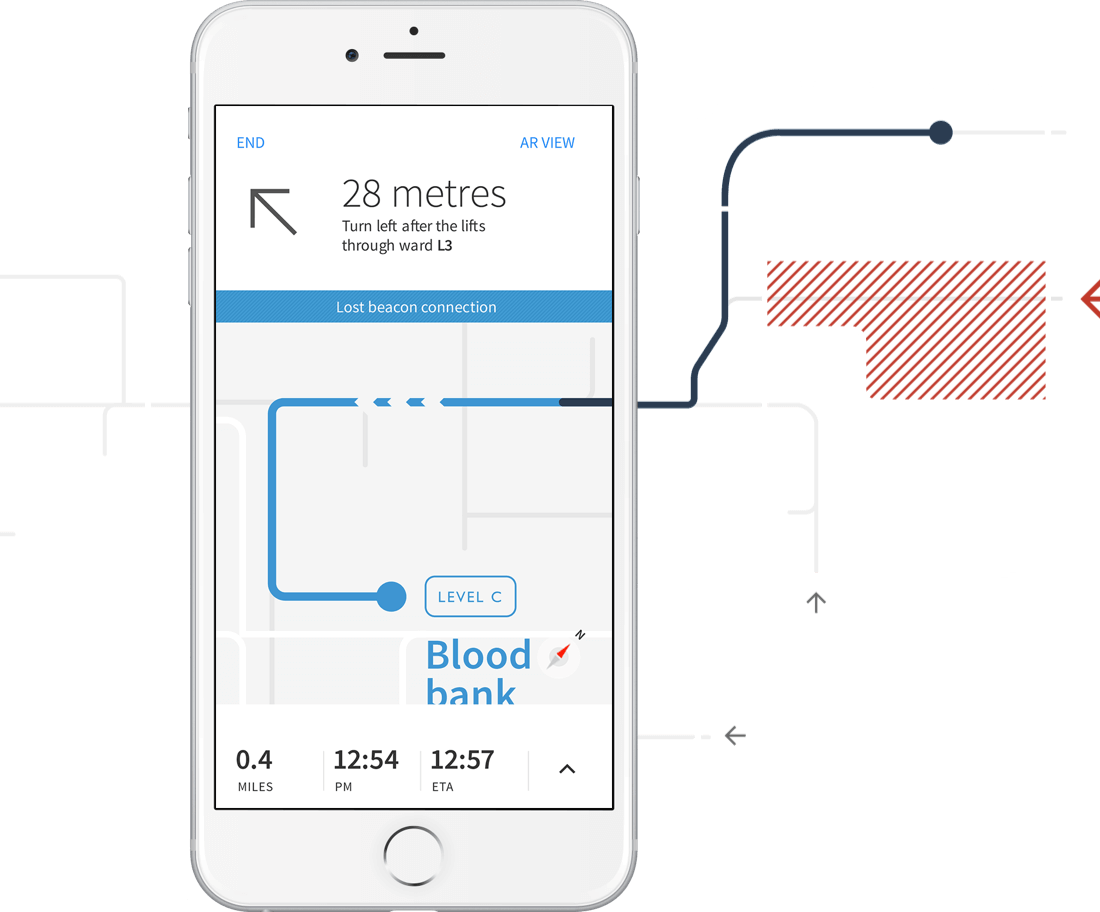
A to B
Hospital site maps are often cluttered and confusing. Stripping the map view back an A to B route gives users their position in context, without overloading them with information.
Care and consideration
In an emergency situation, HCP's need to act quickly and confidently. Large touch zones have been used to prevent mistakes in stressful situations. Care has been taken to group and space the information to ensure legibility.
In conclusion
Hospital navigation is problematic, especially for staff, due to poor signage, illogical mapping and an environment under near-constant construction.
By adopting a smart, feasible, indoor mapping solution - conceived with usability and accessibility in mind - we can reduce the time it takes for all HCPs to reach their destination.
This project was presented at the Sign Design Society in 2016 to experts in the wayfinding profession.